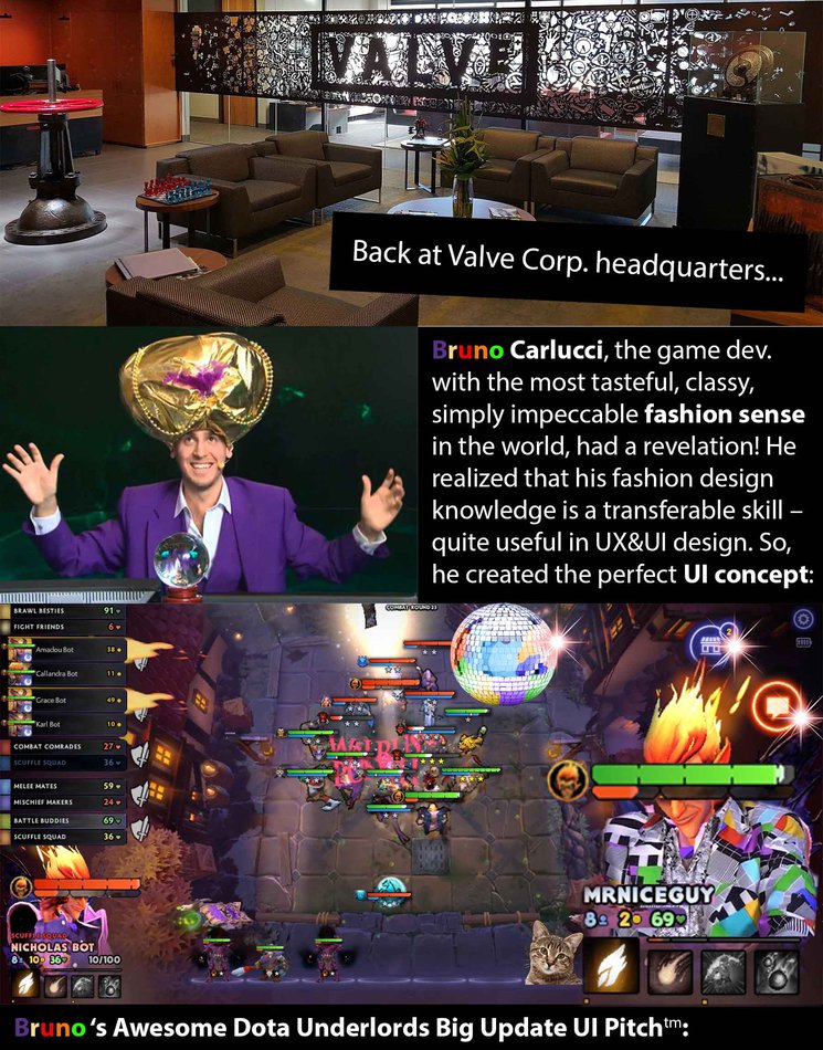
- The
attention falls on what’s most important in the game - the namesake Underlordstm (which are also quite
fashionably designed), as seen on the right.
- Other less
important details like the battling heroes are represented mainly through Health Barstm so that
players will be able to gather all the information they need (if they ever need
some) with a single glance.
- Above the
Underlord, other frequently used UI elements (chat & shop buttons)
are easily visible thanks to their neon
colors and classy blingtm.
- The Disco Ball above the board is the
artwork’s centerpiece. It provides useful light above the board and makes it
seem like the heroes are dancing, but
with more stabbingtm.
- A cat – everybody likes cats! It will
simply take the last bench spot, I’m sure no one will mind! Later on, this could
become an equippable vanity item and we can sell e.g. Gabe and Ice Frog cutouts
for ~$1m.
Conclusion: the player base will love the new UI! We’ve been
building up the expectations for the big update for so long that I decided to
go the extra mile with this concept. It’s technically not possible to disappoint
anyone with the new UI!
P.S. Hello,
dear colleagues! Just making sure it’s perfectly clear any ideas used in the abovementioned
UI for the Dota Underlords Big Updatetm
are created entirely by me (Bruno
Carluccitm) and no one else. Make sure this is reflected in my
yearly employee report at the company. Thanks and have a great post-update period!